In the era of do-it-yourself web design tools, it is easy to start thinking that web design is a no-brainer and it should “not take very long”. But did you know that so much more goes into a website design than what you see? I’m talking about the psychology that’s subtly implemented into everything you see on a website that may influence you to think a certain way or perform a certain action! As designers (that includes graphic, usability, interaction, interior designers etc), we can all agree that at the forefront of everything is the user. A design is useless if it fails at engaging or helping the user, and a design is bad if it fails to fulfills its purpose or frustrates the user.
So how do we implement human psychology into website design?
The Serial Position Effect
Experiments¹ have shown that when participants are presented with a list of words, they tend to remember the first few and last words only, and likely forget what was in the middle.
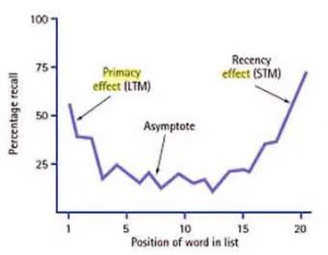
Image credit Simply Psychology
In other words, items at the front and back are most prominent and retained well in people’s memories. With this knowledge, we can apply this information on to websites as well. Using the serial position effect, you can control user behaviour by placing the most important things at the start and end.
Place the most important things at the front and back
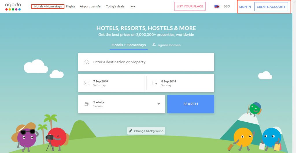
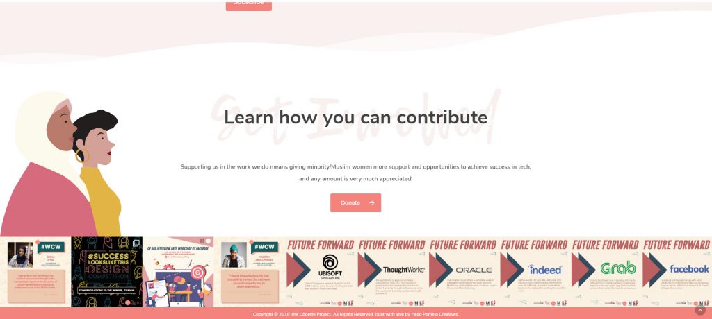
Agoda’s website
There is a reason why user sign ups and call-to-action buttons are put at the end of the navigation bar. Not only is this because it is “the norm”, but the user’s eye tends to remember the first and last items due to the serial position effect. After exploring the site, you suddenly decide to create an account, do you instantly remember where it was? Yes, because it was positioned at the end, and not in the middle of the navigation bar.
Hotels + Homestays are also the first item on the list because Agoda has determined that this is the most popular aspect of their website.
Even though all this may seem obvious to you, this technique can also be applied to things that are not as straightforward.
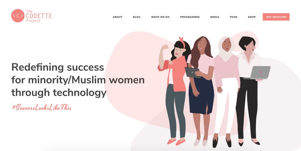
The navigation menu – one of the most important parts of a website
Note how “Get Involved” is placed right at the end because this is the call-to-action that we want from visitors of The Codette Project‘s website! Not only that, it is also differentiated further by giving it a background colour. The first item in the menu is About because we want people to know what The Codette Project is all about. This is also why I really dislike using the prime first spot for the “Home” link. Although this topic is quite controversial, I would recommend some A/B testing to see if this works with your audience.
This is also why the call-to-action is always placed at the bottom of the website and not somewhere mid-way.
The call-to-action is always at the bottom of the site
The Von Restorff Effect
The Von Restorff Effect, is also known as The Isolation Effect, and that simply means that an element that differs from the rest will most definitely be remembered.
Again, we can use the example of The Codette Project’s menu item. Look at how “Get Involved” has been isolated from the rest of the menu items. Despite it being on the same line, it having a button-like appearance makes it pop! Making objects that YOU want your audience to click on is one way you can influence what happens next. This can be applied to “Add to cart” buttons!
Emphasising Call-to-Action Buttons
Look at this pretty complex Qoo10 product page.
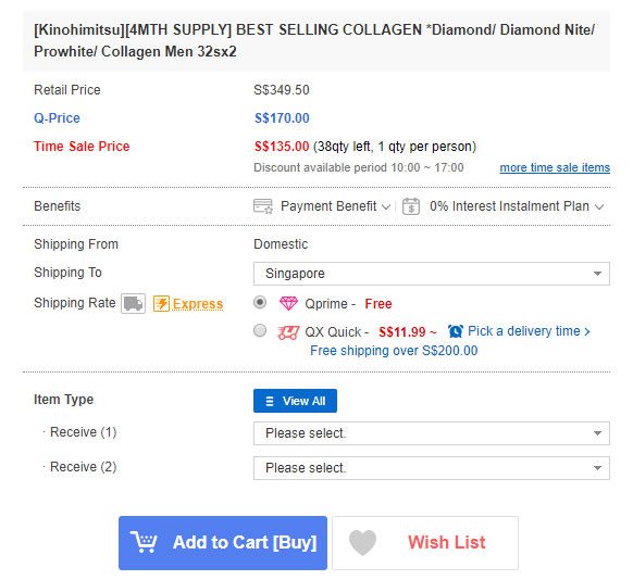
There’s so much info, and there are 2 buttons at the bottom – Add to Cart [Buy] and Wish List. The “Add to Cart” button is differentiated from everything else on the page by its size and background colour. Even being placed next to the Wish List, we understand that “Add to Cart” is the intended call-to-action (and not add to wishlist). The website is thus influencing the buyer’s psychology to make the purchase, instead of just keeping it in view.
The Aesthetic Usability Effect
Users often perceive aesthetically pleasing design as design that’s more usable.
Studies have shown that users are more tolerant of a minor issues if your website is aesthetically pleasing. Although this may seem pretty superficial, it’s true! A bad/ugly design with the same issues frustrates users a lot faster than one that has an aesthetically pleasing and professional look. Essentially, humans are visual creatures and something beautiful can actually help to mask issues that would otherwise not have been discovered or noticed.
Could you also then charge a higher price for your services or products if your website looks beautiful? If your website was aesthetically pleasing, this rule states that users will also be more tolerant to any technical issues they may encounter in the use of your website.
Form and function should work together. When interfaces suffer from severe usability issues, or when usability is sacrificed for aesthetics, users tend to lose patience. On the web, people are very quick to leave. On the phone, they are quick to delete.
– Abhishek Cakraborty, medium.com
So do consider the importance of having a beautiful website, as much as its functionality.
References
- McLeod, S. A. (2008). Serial position effect. Retrieved from https://www.simplypsychology.org/primacy-recency.html